
Fall to me is a time where I can step out of my comfort zone and experiment with fashion. In summer you don’t have a lot of options, especially in Houston when it comes to clothing – you are so hot the thought of ‘layers’ makes you want to jump into a freezing swimming pool! If you are a fashion-risk-taker (sometimes I can put myself into this category) then the designers are following suit this fall. Let’s shy away from dark fall colors and start embracing the lights and vibrancy they have to offer us. There are four important colors you need the 411 on….
Leopard prints
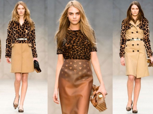
I have always had a thing for Leopard print clothing, especially matched with Red Lip stick and thank goodness it’s one of this season’s biggest shades! I have learnt just how to incorporate it in my wardrobe without looking too in-your-face-look-at-me to more elegant and understated but with a certain confidence. Leopard has exploded onto the catwalks from the likes of Burberry, Celine and Saint Laurent to name but a few. Feline spots are well and truly in!
The old rules are out thinking that the print can’t be paired well with pieces that are boldly embellished or with other colors opposed to black or white. This season it’s all about prancing out in full-on leopard print midi dress without seeing shocked glimpses following your every move. Black, grey, and camel all look chic when paired with the print, but bright crimson, cream, cobalt, and even mustard yellow lend a modern edge to leopard print. For a smaller dose of the pattern, a pointy toe shoe or clutch in a feline print will add a subtle pop of interest to an ensemble. When mixing prints, think of the leopard print as a neutral – that will make everything easier!
Orange
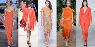
Orange is one of fall 2014’s most embraced colors and is officially the new black in town, so it may be time to hop on the pop of color train. Make the color more manageable by pairing it with equally trendy gray (which has we have written about at the start of Fall is well and truly in!) Pink and red look particularly stunning against orange, but be careful to choose tones of each shade that complement each other and of course more importantly your skin tone. When it doubt, orange always pairs well with white or black if you want to play it safe. I usually pair my orange pieces up with Khaki/blue pieces.
Pastels
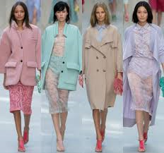
Pastel clothing isn’t just for spring and summer anymore. So, you might want to try mixing pastels with other hot neutrals (like gray and beige) for a trendy, urbane look or try adding a pop of lightness to anything you happen to have in your closet. Anything goes from casual jean outfits to elegant dinner ensembles. In my opinion, pastel clothes and accessories really give a nice counterpoint to this season’s edgy gray sweaters, coats, and dresses. Pastels feel young and fresh especially this time of year when it’s so cold outside and all you want to do is wrap up with safe colors.
Blue
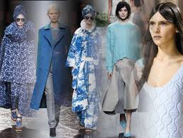
We’ve already talked about how autumnal tones and pastels are adding up to being the biggest rollers, but blue (dark, light and everything in between) also had a strong presence on the runways this season. From cerulean, cyan and cobalt to navy, sapphire and periwinkle, countless shades of blue are going to be seen on dresses, tops, skirts and more this fall. There was a huge presence at Burberry and Richard Nicoll’s. It’s a color that can last the seasons and can be interchangeable. This means in summer, spring, winter there will always be a calling for blue shades. When you’re updating your fall wardrobe in the coming months, don’t forget to add some color to it (you can’t wear all black all the time!). Take a hint from the aforementioned designers and make blue a staple in your closet.
